Reimagining a New Web Identity to Help an Arts Organization Thrive Post-Reopening
The focus of this project was to redesign the Columbia Center for the Arts website based on an understanding of business needs to help them accomplish their goals and become a cultural destination for the arts in the Columbia River Gorge.
How can a new online identity and website help an arts organization become a cultural destination?
Problem
The Columbia Center for the Arts website was in need of a redesign. The organization was forced to shut down for most of the pandemic and was reopening.
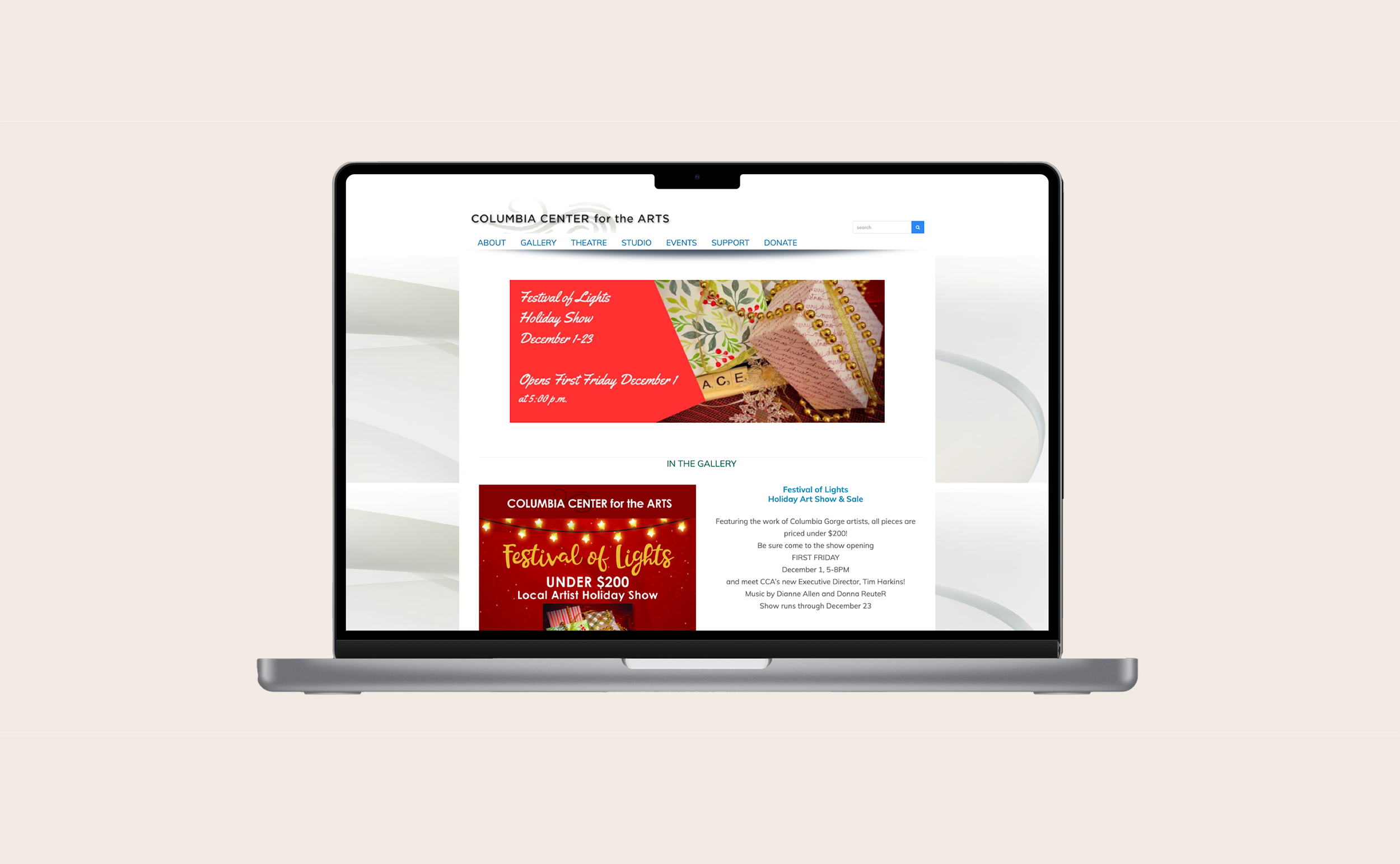
The website was in need of a visual update, but also needed to be updated to improve usability to enable the organization to accomplish its goal of creating a cultural destination in Hood River, OR, with facilities that enable the arts to thrive in the Columbia River Gorge.
The current Columbia Center for the Arts website.
Details
Role: Product Designer
Methods: Prototyping, Sitemapping, UI Design, Wireframing
Tools: FigJam, Figma, Procreate
Methods
Homepage wireframe
Sitemapping
To create the new Columbia Center for the Arts website’s information architecture, I relied heavily on the organization’s business goals to guide the overall structure.
I researched the organization to learn as much about the business as I could and conducted a competitive review to better understand the business space.
I documented the information architecture of the organization’s current website to understand what content existed and how best to organize and structure it.
I created a new information architecture and sitemap that more closely aligned with the organization’s business goals of bringing more people in the doors for events, classes, and gallery shows.
I met with stakeholders to discuss the proposed information architecture and clarify business needs.
I revised the information architecture and sitemap based on findings from my conversation with stakeholders, elevating several items, Exhibitions, Events, and Classes, to top-level navigation to help the organization accomplish its goals.
Wireframing
I used Procreate to sketch out wireframes to generate ideas before beginning higher fidelity design work.
Exhibitions page wireframe
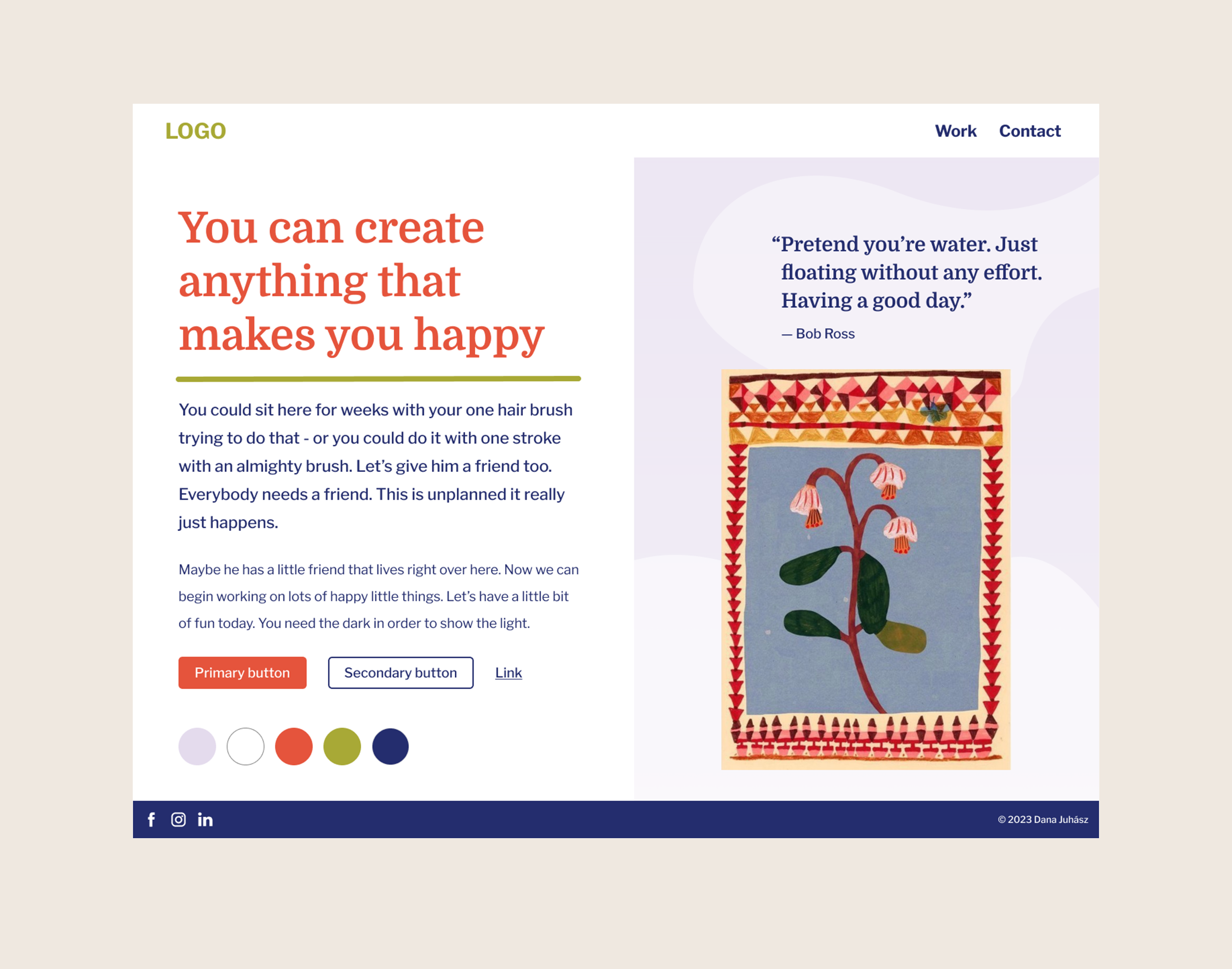
Simple style tile designs to test various design concepts before beginning high-fidelity design
Visual Design
I took inspiration from the surrounding nature of the Columbia River Gorge area, researching endemic wildflowers, wildlife, and the surrounding land to create the color palette.
Next, I focused on choosing type styles that worked together to reflect the values and personality of Columbia Center for the Arts and the local region. I chose Bitter and Work Sans typefaces for their clean readability, humanistic qualities, and flowing rhythm evocative of the Columbia River.
I conducted a competitive review of art museum, gallery, and other websites to generate ideas and to better understand the business space.
I created several style tiles to test visual design ideas, color palettes, and typography.
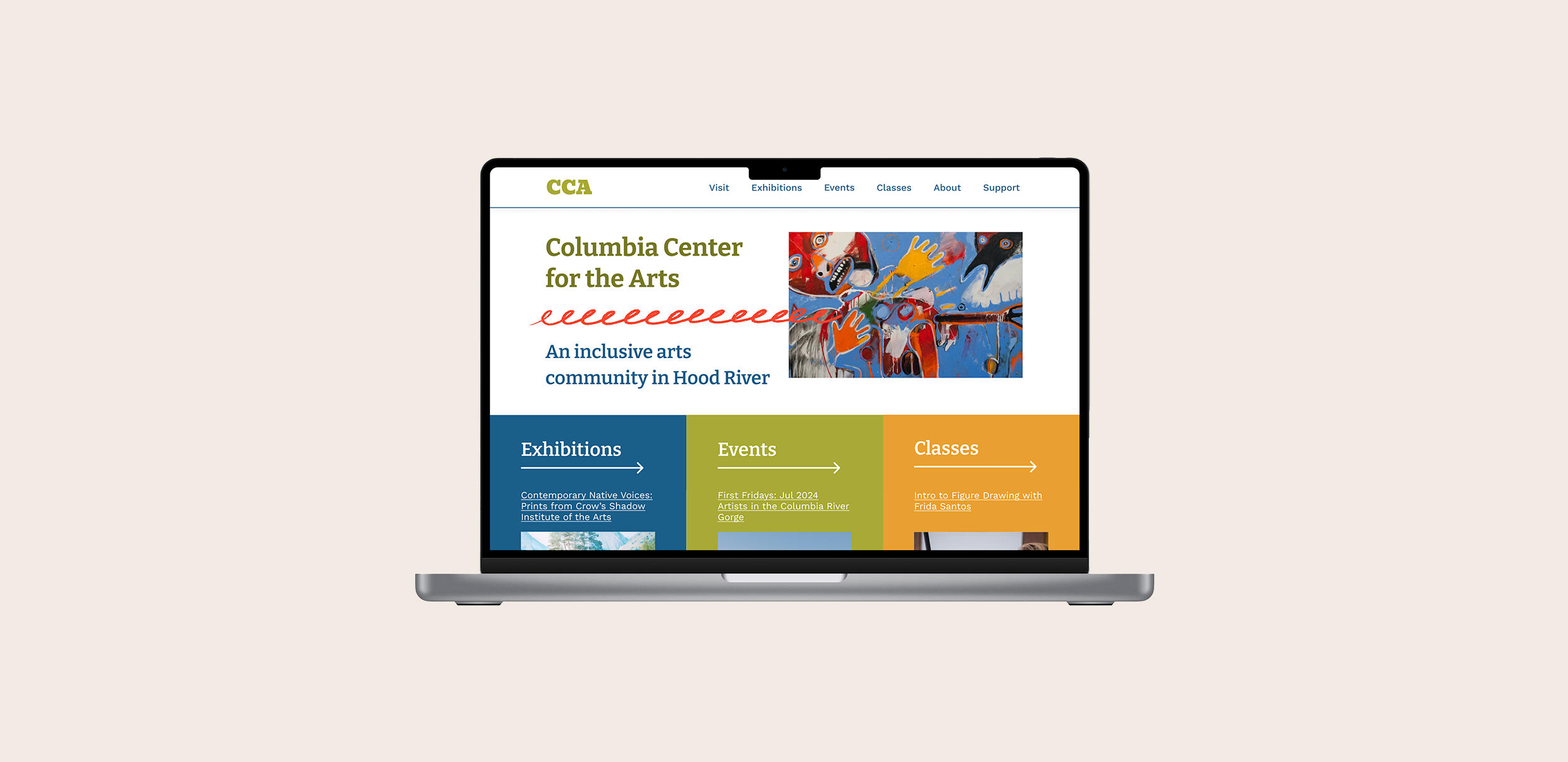
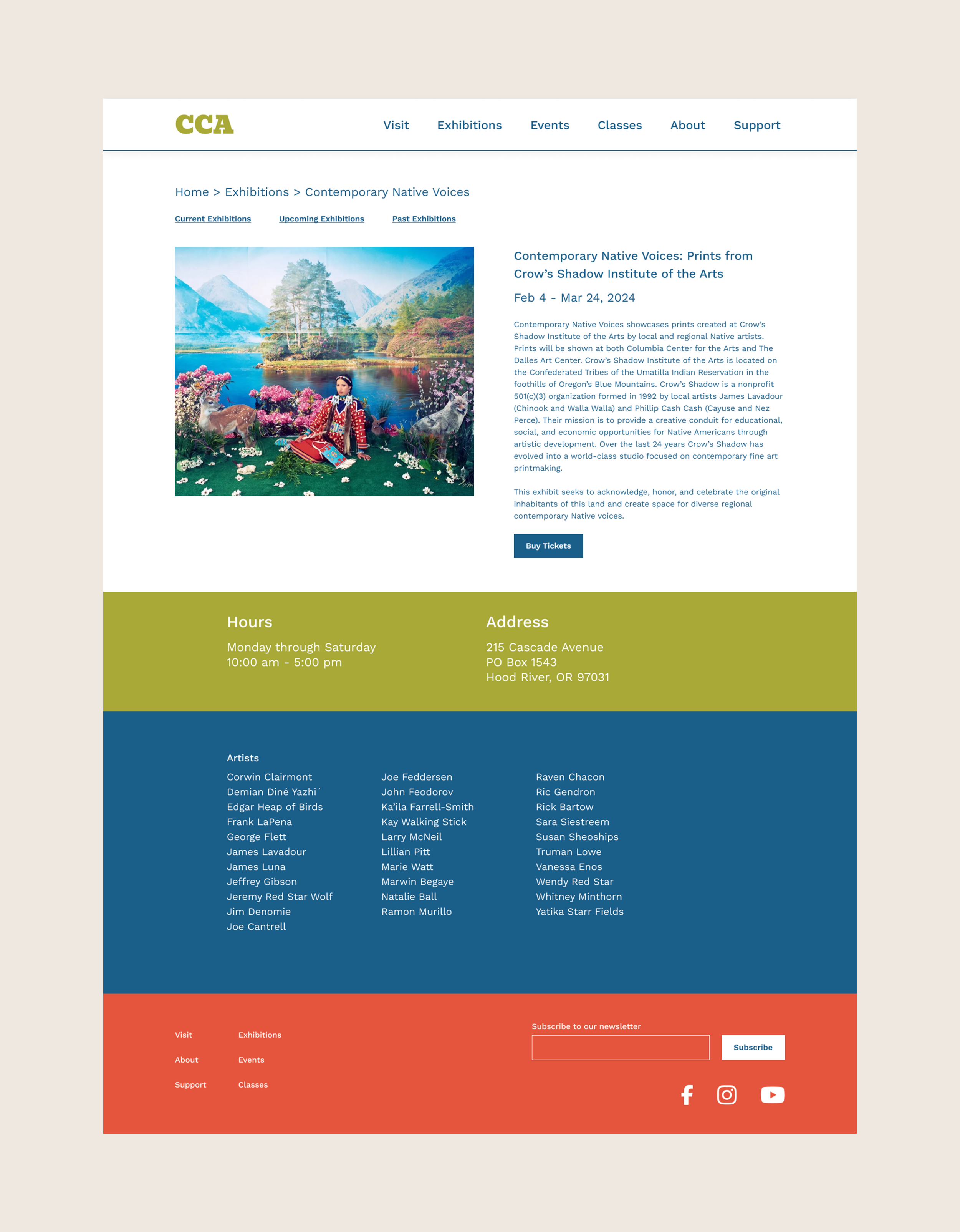
Once I settled on a design direction, I began to create high-fidelity mockups. I focused on designing those pages needed for users to find detailed exhibition information: the homepage, exhibitions page, current exhibitions page, and exhibition details page.
Homepage redesign
Exhibitions page redesign
Current exhibitions page redesign
Exhibition details page redesign
Exhibition Details page wireframe
Next Steps
Review designs with stakeholders to generate feedback for design iterations
Conduct usability testing to refine website design


